Anscombe's Quartet #
Summary #
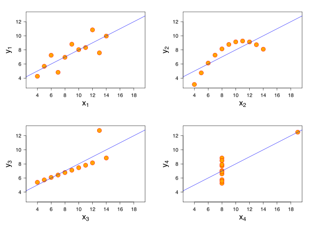
Anscombe's quartet was created by Francis Anscombe to demonstrate the effect of outliers. All four datasets have the same average, variance, correlation, and linear regression, but look completely different when graphed.
Lies, damned lies, and statistics!
(Image: Wikimedia)
Commentary #
Anscombe's quartet is a neat example of how even large differences between datasets can be hidden by outliers. There is a false sense that the sets are comparable in some way just because they share many statistical properties.
Luckily, a simple graph of the sets reveals the effect. However, graphs can deceive in several other ways:
-
Captions - A graph's caption can create an expectation that will distort our perception of the graph (the same applies to photographs).
-
Playing with Scales - There are several ways this can be accomplished:
- A compressed or expanded scale can make changes seem larger or smaller.
- Gaps in the scale can make it harder to make judgments of how large a value is.
- Different scale units or sizes can make direct comparison between two datasets seem possible—even when it doesn't make any mathematical sense.
While I'm interested in the best techniques for presenting data, it's important to understand that there is more to the experience of reading graphs than just presenting the information—our choice of presentation can divert the reader away from the underlying truth about the data.
See Also #
-
Anscombe's quartet at Wikipedia
-
Misuse of statistics at Wikipedia for some other ways that statistics can be misused.
-
Most Misleading Graphs for an interesting set of graphs.
-
How to Lie with Statistics at Amazon for a humorous approach.